(This post was supposed to be written 10 days ago but a lot happened during these past days and I get to begin with a not-that-important-but-I-still-wish-to-bring-it-up topic...)
Every time when we're publishing with coloured figures, a dispute between my boss and me happens regarding to the colour scheme. However, I know I get to restrain myself not to produce images following my own colour sensation. Scientific figures are not focusing on to be moe artistic (although it's not bad). I'm tired to argue with people who are somehow colourblind. So I follow whatever you desired and make you happy and avoid the useless discussion -- anyway, there's nowhere saying the person who made the pictures was me, which makes me relieved.
Yet I just don't understand why he dislikes orange... I can still remember the very exciting moment when I discovered how pleasant it is to put purple and orange together, when I was 6 or 7-ish.
Yet I just don't understand why he dislikes orange... I can still remember the very exciting moment when I discovered how pleasant it is to put purple and orange together, when I was 6 or 7-ish.
✿ฺ ♡ ✿ฺ ♡ ✿ฺ ♡ ✿ฺ ♡✿ฺ ♡✿ฺ ♡ ✿ฺ ♡ ✿ฺ ♡ ✿ฺ ♡
So now, let me leave it and go back to the main topic.
↓↓
5+4+3+4=??
↓↓
5+4+3+4=??
Back to 10 days ago, my brain had completely no response to it -- and I couldn't really blame it as it was after spending "that" many hours working on another visualisation.
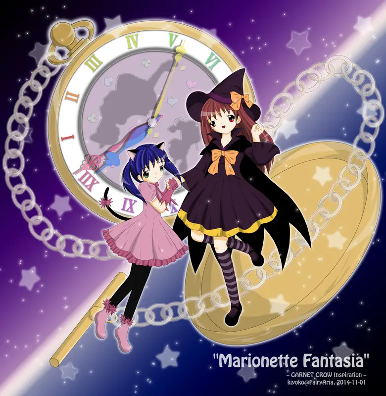
I eventually titled it "Marionette Fantasia", a song by GARNET CROW, which was also the melodic motif of it. Seems I haven't got anything based on their songs before as Akiko/Noriko/KOKIA/etc have occupied my power of delusion (think carefully again I did have one, but I'd prefer not to tell what exactly it is as it's considered as of my dark history). Though I could tell the truth was that right before I started sketching up, there was not a single tune at all. 10 days ago, it was the ghostly period (I mean Halloween), so my initial idea was simply for that only, and had another completely different (I'd say much crazier) setup. Yet human's brain is so complicated that it may go too fast that ignite something else and leave the original idea light-years behind.
Perhaps the only common thing between this and my old ideas was some (not too many) halloween-ish elements. -- I should actually visualise my initial idea in next year (I won't forget as it's in my google-keep~).
The song "Marionette Fantasia" is really full of triggers to my imagination. Since the first time I heard it various pieces of illusions were flying around in my mind. Even "worse", they were not merely static images, as the music flows, all the scenes came together and became a short film. I really have the motivation to make it through but it's such a shame that I don't know how to make a film at all (not mentioning drawing every single frame and record them in sequence of course).
Therefore, sadly I had to stick to the static. Yet on the other hand, it saves me time (compared to making a real film) so I was able to spend more energy on the total makeup. Although for most times I tend to use copyright-free images if they fit well, it's not the case this time. To deal with a proper background, I looped that song for a few hours. I couldn't pay no attention to the repeating motif words: "time/midnight/clock hands/etc". This was probably how I ended up with this special pocket watch.
↓

↓
I did struggled on the pattern of the clock face. From blank white to working gears to the current silhouette. I attempted to apply something like "The Nutcracker", but soon switched to "Alice in Wonderland" as the related symbols are easier to be recognised. (My secret words here: at first, the entire clock face was designed to be black-white only and very solid, but after I tried dyeing all these elements with different hues, I couldn't stop to give it a softer tone).
and now I want such a watch...
and now I want such a watch...
-- Speaking of "Alice in Wonderland", Katakiri Rekka's "幻想廃人 (Gensou Haijin)" was another song that came up in my mind. Its "Pray of happiest pianist." version was awesome (piano arrangement only, I prefer the original sining voice as well as the sound effects). I actually considered integrating some "dark materials" while making the clock, but eventually I didn't -- what I've done just didn't match with any kind of dark stuff! xD
The general file dimension back to 2006 when I just started to use a tablet was around 2000px, but now to have a file like 10k x 7k isn't rare any more.
I could have used AI to make such a clock with lots of standard shapes, but I was confused by merging different shapes to create a single irregular object and I stayed with PS (I got go back to PS anyway to apply effects). The final file size, solely contained the clock, was over 200M.
↓

my currently biggest file!
I could have used AI to make such a clock with lots of standard shapes, but I was confused by merging different shapes to create a single irregular object and I stayed with PS (I got go back to PS anyway to apply effects). The final file size, solely contained the clock, was over 200M.
↓
my currently biggest file!
✿ฺ ♡ ✿ฺ ♡ ✿ฺ ♡ ✿ฺ ♡✿ฺ ♡✿ฺ ♡ ✿ฺ ♡ ✿ฺ ♡ ✿ฺ ♡
At last, something more off topic!
1. While seeing this huge map in Silent Hill Zero, I was in despair...

Doing biohazard, there's no need of a map since the 2nd time play, but in Silent Hill, a map always saves your life even at the 5th time...
My miserable sense of direction... ~_~
(Although to me, SH0 is harder than any of 1/2/3/4 only because I couldn't change the button config while it has the damn reversed X and O button settings.. orz)
2.

↑Leon was so irony!!
Just finished watching Biohazard Regeneration/Damnation, which confirmed my decision to do biohazard 6 (regardless lots of people saying it's bad) -- Because Leon is there, I gotta do it! <3
↑Leon was so irony!!
Just finished watching Biohazard Regeneration/Damnation, which confirmed my decision to do biohazard 6 (regardless lots of people saying it's bad) -- Because Leon is there, I gotta do it! <3
The 3D movies were great, with lots of familiar cutscenes I've seen in game (although together with many conflicts in terms of settings I wanted to butt in). They are much, much better than those live action movies, at least the "true" image of each character in this entire series got maintained. Leon is Leon, he can't be acted by any one else.
It's true that people in biohazard are all supermen. I mean, a normal person will definitely die (or have a few bones broken) after being tossed for multiple times against the ground/wall by the section head (which is the nick name of >>) Tyrant... ^^;